Monday, April 13, 2020

Change in Relative Competitiveness Post-Coronavirus: Individual, Industry and Country Level Thoughts


Change in Relative Competitiveness Post-Coronavirus: Individual, Industry and Country Level Thoughts

Part 1: Individual Level Effects

Will Coronavirus episode effect the relative competitiveness of countries, companies and individuals? If so, how can we measure this? How can we make a projection or at least some sensible prediction on the subject?

Starting from bottom up, individual positioning will be effected by the following factors:
·         Individual’s knowledge base (a)
·         Individual’s economic organization (company, organization etc) (b)
·         Individual’s country or relevant superstructure (c)
·         Global developments (d)
·         Good old random factors sometimes called luck (e)

While sometimes the most effective, let us leave out the effect of random events and/or luck, as it is hard to quantify yet effective on all other factors. The equation for an individual’s competitiveness based on these factors will be something like:

( (a x w1) x (b x w2) x (c x w3) x (d x w4) ) x e

In this equation, w figures represent the relative weights of each factor and e is a global effect.

To put this in perspective, let us take three practical examples. John is a waiter at a busy city center restaurant, Mary is a software engineer working for a videoconferencing company and Sarah is a nurse with an intensive care specialty. For this example, let us base them all in London.

For John:
·         John is undertaking a generic job, which worker replicability is high and barriers to entry are low. On a ranking of 100, he gets 20 for this job (a).
·         Restaurant sector is relatively hard hit but with restrictions easing in couple of months, a significant recovery (albeit maybe not to the previous level without some competitors going out) is to be expected. On a ranking of 100, restaurant sector gets 70 (b).
·         UK’s and London’s performance during the pandemic and following it will not have a material positive or negative impact is my assumption. Thus as one of the primary global locations, the rating will be 100. (c)
·         However, with global travel demand falling, the prime location status will be negatively affected even if for a shorter duration. The rating is 70 for this factor as well. (d)
·         For John alone, the most important factors in this specific line of business go as follows: John’s performance w1 (30%), specific business w2 (40%), and w3 and w4 getting 15% each.


For Mary:
·         Mary has a specialized job with global high demand now. On a ranking of 100, she gets 80 for this job (a).
·         Videoconferencing software is going through a boom now. On a ranking of 100, her sector gets 100 (b).
·         London or any other city is not a solo defining competitive characteristic for this industry and the ranking is a positive natural with 60 (c).
·         Global demand for videoconferencing is high and expected to rise. However, there is intensive competition reducing this rating. The rating is 80 for this factor as well. (d)
·         For Mary, the most important factors in this specific line of business go as follows: Mary’s performance w1 (30%), specific business w2 (35%), , w3 gets 5% minimum and w4 gets 30%.

For Sarah:
·         Sarah has a specialized job with global high demand now. On a ranking of 100, she gets 90 for this job (a).
·         The hospital Sarah works for is on the frontlines now and other hospitals might engage her services. On a ranking of 100, her sector gets 100 (b).
·         London as a big city is relatively more robust with job opportunities for Sarah: 90 (c).
·         Global demand will remain very high for the next 2 years and furthermore might keep up with national epidemic planning. However, there is a big personal health risk factor in this occupation: 80 (d).
·         For Sarah, the most important factors in this specific line of business go as follows: Sarah’s performance w1 (15%), specific business w2 (40%), w3 gets 15% and w4 gets 30%.

If we tabulate the inputs, this the summary output:


Based on the output, the following inferences can be made:
·         Each occupation along with the setting where it is performed and global trends requires a different weighting to analysis.
·         There are marked differences in the competitiveness of different jobs.
·         However, this is a dynamic analysis as factors favoring or disfavoring will change. For example in a high demand situation such as today, a nurse’s performance is less important than the fact that he/she is a nurse. Such a factor will normalize and emphasis on performance will take more weight in a normalizing situation. 

In summary, as we all knew different occupations had different attractiveness and competitiveness before the coronavirus episode. However, coronavirus has amplified some expertise and sectors over the others. While most of these effects will normalize over time, prevalence of certain skill sets pertaining especially to digital expertise along with adaptation to new modes work will have even greater role. Combined with the quickening of the general business cycle with emphasis on new modes of doing business (videoconference before you meet, collaborate remotely on the document etc) and change in relative growth differentials among sectors will have a profound effect on individual competitiveness in the very near future.

…

Part 2: Company / Sector Level Positioning


I have prepared a subjective assessment of a variety of industries and listed a number of factors effecting them all and grading them on -10 to +10 scale. The data table is presented below.


The validity of the assessment is subjective and with most of the work I am doing with the coronavirus episode, it is mostly intended to foster further thinking on the subject. To that end, there are various observations of note from the data:

·         There is a huge divergence in the Total Score with industries such as Airline, Luxury Items, Automotive, Tourism and Restaurants hit very hard while Online Media, Pharmaceuticals, Healthcare, Telecoms and Software benefitting from the situation.
·         This reaffirms the premise of this article as to the point that while the capitalist superstructure will be intact, relative distribution of winners post coronavirus episode will change meaningfully.
·         Individual effect of factors are interesting to watch as Digital Transformation and Government Intervention (most to provide support with different measures) will have positive impact in general.
·         No change in long-term growth potential or consumer behavior is predicted via this table.
·         However, current measures are having and will have a major toll on certain industries as to be expected.


…

Part 3: Country Level Competitiveness

I have looked at changes in GDP and relative share of global GDP per country to look at historical change in country level competitiveness. While there could be other and better factors to explain relative competitiveness changes, in a 10-year period or longer GDP performance would be a general all-inclusive metric to reflect most other factors combined.

Let us look at the data first. Note that Data is primarily from World Bank and I have updated 2019 figures with Countryeconomy.com data. 


In this part, the emphasis will be on historical context with the premise that current conditions can speed up historical factors (on the same or on the opposite trajectory – but faster). As such, this is what the data shows in general terms:
·         From 2001 to 2019, the most notable change is China’s rise from 4% of World GDP to 16.4%.
·         Similarly big relative increases are observed for India and some emerging markets to a lesser degree.
·         For this period, the relative loss is shouldered primarily by the US and Japan.
·         However once we change the scope to 2009 to 2019, then the picture is different. The US for example stays at 23.9% of World GDP for that period. China goes up by 7.9% - this time from Japan and Europe.


Once we look at the the even closer period from 2017 to 2019, except for China the global effects are limited and contained in certain economies with either country specific potential or problems. Yet China’s ascendance continues.


The table below is built on the same data but shows the ratio of a country’s share Vis a Vis different periods.


To sum everything up, there will be a major change in competitive position of both individuals, sectors and companies. The combination of these three headline variables could have profound effect on each one of us. However, it is my expectation that this major redistributive effect will still take place within the general parameters of the current global economic order. That change is yet to come later and we have enough of a change within the current system as it stands.


April 2020

Sunday, April 12, 2020

Covid-19 Mortality Divergence: Data and Conjecture


Covid-19 Mortality Divergence: Data and Conjecture

Why is this Article Written?
I am not a statistician and the scope of this article in statistical terms is beyond my capability. However I believe I can be helpful in asking the questions that others can pick up on and develop further. As such this article is an attempt to draw attention to important yet nonetheless out under the sun issues regarding the Coronavirus episode. Its primary aim is to help our understanding by fostering analysis and deeper thinking about the issues at hand.

The Question: Why such a big divergence in mortality?
Coronavirus world level data shows big divergences in number of deaths among countries. There are the likes of Belgium, France, Italy, Netherlands, Spain and United Kingdom where mortality from the confirmed cases are 10% and upwards. At the same time; Canada, Germany, South Korea, Switzerland, United States and Turkey report 4% and below mortality. Data quality and stage of breakout in each country notwithstanding, the divergence is too great to ignore. What could be causing this divergence?

Potential Answers: Focusing on available data with testing, cases and deaths
Data quality and stage of breakout are both potentially important factors but given the size of the data and the length of the breakout, a sufficiently large sample size might negate analytical problems with them.

A reasonable answer is that higher mortality is reported by countries who do not test extensively. This is a tricky issue as extensive testing is not only related to numbers but also to sample distribution. While a high number of tests is more likely to indicate a wider country level distribution, it does not necessarily have to be so. In addition, number of tests does not mean number of individuals tested. Indeed the total test size might include multiple tests for same people including repeated tests for healthcare workers lacking any qualitative data to smooth for this factors, number of tests was used as the main indicator for coverage. Prior to data analysis, my hypothesis was that those countries with higher mortality rates would have (i) less tests per 1M population and (ii) higher confirmed cases per test. The first implying relatively limited coverage and the second showing focus on more symptomatic cases (and potential overextension of healthcare system due to high number of cases).

Another answer was the quality of the healthcare system and yet another was the effect of preventative measures on the overall progress of the epidemic in that country. Higher mortality question has an answer that probably is a composite of these and other reasons (genetics, demography and such) but for the purposes of this article, I’ll cover the testing, cases and deaths angle to see if it helps to tackle the question better.


Methodology
I wanted the work to be as timely as possible but April 9 figures was the most up to date I can get with enough of a sample. To this end, I extensively used the data from Our World in Data https://ourworldindata.org/coronavirus along with Statista https://www.statista.com/statistics/1028731/covid19-tests-select-countries-worldwide/ and Worldometer for population figures https://www.worldometers.info/world-population/population-by-country/.
For France, Germany and Sweden, I took the test figures from April 8 and extrapolated quite liberally to April 9. Given the short duration, I believe my extrapolation should not cause a meaningful statistical divergence.
I took a sample of 28 countries that have a cumulative population of over 2.7 billion people. I left out China as its testing data and its stage in the epidemic was not compatible with most others in the sample.
I’ve used 4 metrics for the analysis: Population, Tests, Confirmed Cased, and Deaths. From these main data points I’ve looked at the following derivatives:
·         (a) Case / Test ratio: Is there a meaningful average among countries?
·         (b) Deaths / Case ratio: There should be a closer relationship here than (a).
·         (c) Deaths / Test ratio: Does this make any sense? If so, what sense?
·         (d) Tests per 1M: This is a coverage check for the country.
·         (e) Cases per 1M: This is an infection spread check for the country. Its relation to coverage could be meaningful.
·         (f) Deaths per 1M: This is to compare countries on the population metric.
·         (g) Tests / Population: To verify as a percentage how much of the population (given reservation in Potential Answers section) was covered.
·         (h) Cases / Population: Same as (e) but to see spread as percentage point.
·         Average, Median and Standard Deviations for these results.
·         Ratio of Standard Deviation to Average to see which factor has a bigger divergence.


Results Table


Observation – 1: Case per Test Relationship
On average 10.65% of tests yield a positive result – a Covid-19 case. However data among countries differ widely from Bahrain’s 1.49% to France’s 32.92%. More importantly there is a clustering effect here. Once the average is breached upwards as is with Switzerland, then the figures are noticeably higher on the higher ratio countries. One explanation could be that, these countries above the average are testing patients with symptoms that are more likely to be infected. Let’s look at this when we examine if there is a correlation between these countries and the number of tests they’ve done in relation to their population which different from the lower Case / Test ratio countries here (*Follow-Up Point 1*).


 Observation – 2: Deaths per Case Relationship
On average 3.97% is the mortality rate from confirmed cases. However, similar to Case / Test statistic, there is a wide difference among countries and cluster effects persist with a group of countries scoring very low or very high on this matter.

As we have the Case / Test ratio as Observation – 1, if the Follow-Up Point 1 was valid then the countries with higher Case / Test ratio should be the ones with higher Death / Case ratio. This would strengthen the fact that these are countries with healthcare systems under strain (along with possible other factors that limit their testing dispersion).


Of the 10 countries with Case / Test averages above the sample average, 7 have Death / Case averages that strengthen that these countries are under the strain of incoming patients (*Follow-Up Point 1*). But 3 out of 10 divergence with Switzerland, Turkey and the US is still worth investigating. I would speculate that Turkey and the US examples are due to their relative lag to the other countries in the sample. This lag could be helping them with better treatment options. Switzerland with its older population and Central European position that probably clocks a similar time needs more explanation. Perhaps its data will converge or perhaps its resources are greater to combat the deaths. Furthermore, Turkey and the US data in to the next couple of weeks is worth observing on this metric.

Finally please note that the ratio of Standard Deviation to Average on this one is greater than Case / Test ratio. As you’d see in Observation 3 – the Standard Deviation to Average ratio would increase further on Deaths / Test metric.


Observation – 3: Deaths per Test Relationship
On average mortality is 0.69% of tests made. Similar to Case per Test and Deaths per Case observations. There is a visible clustering effect here. As this is a derivative of the first two observations that uses two variables which were covered in Observations 1 and 2, let us check the validity of this expectation with a table.


Deaths per Test ratio seems to point out to countries which have relatively a bigger problem dealing with this pandemic. Note that Switzerland, Turkey and the US drops from this list as well from the Death / Case list. The countries on this list are the ones that have trouble with containing their death figures.

Please note that the analysis is based on the sample as of April 9. Spain for example would possibly on this list but its data was not readily available in the sources I used.

Finally note that Standard Deviation to Average increases further on this metric. I would speculate that the increasing magnitude of this metric from Case/Test to Death/Case to Death/Test shows the divergence of epidemic progression in different countries. While the difference is observable in the case confirmations, it is amplified in how the discovered cases fare afterwards. For further analysis, there is a follow-up point here as to the validity of some countries doing a lot better in dealing with coronavirus.


Observation – 4: Coverage Ratios
Coverage Ratios deal with how much of the population was tested and what were the results per 1M of population or as a percentage of the total population (whichever method is easier to look at).
On average 9,440 test per 1 million population has been conducted as of April 9 with our sample set. This corresponds to testing only 0.94% of the total population. However given multiple tests, actual number of population tested would be below this figure.

On average 750 cases have been confirmed for each 1 million of population corresponding to 0.07% of the corresponding populations confirmed to be infected.

The averages look pretty low and the distribution is a bit different from other observations. Some countries such as Bahrain, Norway, Estonia, Switzerland, Germany, Italy and Austria among them have done extensive testing. Most of these countries have fared better except for Italy in the number of deaths. This is similar to the others in the top of testing list. I believe this is beyond coincidence and there is a clear positive link between number of tests conducted (as a percentage of population) and the success of a country dealing with its epidemic.

There is a subset of countries that are more than 1/3 below the average in Tests per 1M ratio. These are Malaysia, Costa Rica, Ecuador, Japan, India and Indonesia. All these countries have below average Cases per 1M ratio. This reaffirms that only with adequate testing, cases are discovered – once again underscoring the importance of extensive testing. Note that of these significantly below average testers, Ecuador and Indonesia have statistically high Case/Test and Death/Case ratios that hint at their inability to detect the extensiveness of the problem in their respective countries. However, on a contrarian note; Costa Rica and Japan have done limited testing and faring well. There is another follow-up point here regarding those two.


Please recall that in Observations 1 and 2, I had a follow-up point contained within this article that was: One explanation could be that, these countries above the average are testing patients with symptoms that are more likely to be infected. Let’s look at this when we examine if there is a correlation between these countries and the number of tests they’ve done in relation to their population which different from the lower Case / Test ratio countries here (*Follow-Up Point 1*).
I was basically asking whether the high Case per Test ratio was due to lower testing coverage for those countries. Let’s tabulate the answer with data from Observation-4.


Of the 10 countries that had higher than average Case / Test ratio, 7 of them have lower than Test / Population ratio. An observation that needs further verification is that these 7 countries are dealing with incoming patients that skew their positive test results to the upside. This on one hand is positive for their future progress but it can also hint at potential bottlenecks for their healthcare systems. For the third time, this derivative analysis shows the importance of increasing testing coverage. To this end, Turkey and the US following the date of this data set have increased their daily testing which in my opinion is a step in the right direction. As for Italy and Belgium that have higher test coverage but still have faced tough times in dealing with their cases, I raise another follow-up point for future researchers. They might have suffered under the onslaught of rapidly increasing infections that needed hospitalization and their testing might not have caught up in time. The answer is not in this data covered by this article.


Observation – 5: Those with the Best Ratios
This article focuses on the problems with the intention of being helpful. While the data is evident in the tables and charts, we can also learn from those countries that were more successful so far. To my surprise, they come from all around the globe. I have defined the success metric as follows: Those countries with below average deaths per 1 million of their population and above average tests per 1 million of their population.

Ranked in order of less deaths, the countries below have tested extensively and prevented deaths. A cursory glance implies all have high income levels but I leave it up for another follow-up point to pinpoint similarities among this sample and comparisons with others in the data set.


Conclusion
It is my sincere wish that this article contributes to thinking about the problem at hand.

I am 100% confident that we will manage to deal with the virus problem. This cycle will peak in April and second half of May will feel somewhat better.

We will have to learn to live with coronavirus for some more time and  the follow-up cycles will test us. To that end, the problem is less to do with the virus than in our response to it. I hope that we learn from each other, co-operate and improve our methods in dealing with it. Success is inevitable but the cost of success is to be determined by our methods.

April 11, 2020

How Big is the Global Stock Market Declines in Local Currency Terms

How Big is the Global Stock Market Declines in Local Currency Terms: Disparity between financial markets and the healthcare situation


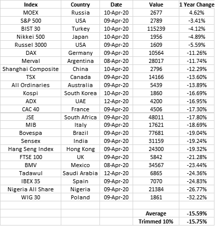
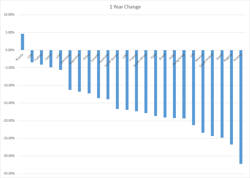
A very short piece to put in perspective the stock market correction globally. All data is from Bloomberg website.
Here are the observations..

General Points:
• 12 month global decline average of the markets listed above is only 15.6%. 
• Declines from highs in the last 12 months are higher but in retrospective a fall of 15.6% over 12 months globally is not in line with a doom and gloom scenario.
• However as the real economy is undergoing severe problems caused by the healthcare crisis caused jointly by the virus and the public response, financial markets seem to have decoupled from the problem.
• The best indicator is S&P 500 which is down by only a 3.4% from a year ago.

Virus Hot Points:
• USA is beating the global average by a big margin.
• The origination point China is better by 3%.
• Italy, Spain and the UK are each underperforming by 3%, 9% and 6% net negative difference.

Other Comments:
• Emerging Market performance is all over the map with different performances.
• There are more outliers on the better performance side which are chiefly Russia, USA, Turkey and Japan.
• If currency effects are factored in, due to US Dollar strength most other markets would have fared worse and some significantly worse in USD terms.

Overall even though and even if in local currency 15.59% decline is big; it just is not at the moment a global crash in local currency terms.

April 2020
Tuesday, April 7, 2020

Hard to Get Back to Normal That Soon

A Simple Question: How Likely to Get Back to Normal this Summer at the Current Infection Path without a Vaccine?


Here are some facts:

  • First confirmed coronavirus case in China (Nov 17 or Dec 1)
  • In 4 months, total confirmed cases: 1,364,711
  • World population: 7,776,170,000
  • Estimate for peak confirmed cases for this phase: 70,500,000
    • (Taking US estimates of potential 100,000 to 200,000 mortality projection's midpoint and applying a 4% mortality rate, the US infections are 150,000 x 25 = 3,000,000 for this phase. With USD population at 4.25% of global population, a direct correlation means around 70,500,000 global infections. Note that this calculation is based on a lot of loose assumptions and I believe the actual figure for this cycle is going to be a lot lower due to under testing, different penetration times, social distancing, Chinese control and India's late spread.)
  • Peak / World Total: 0.91%

Here is the only question for this article: If 1 infection in 4 months led to the current situation; how would we able to cease the current preventative measures without a vaccine and only 0.91% global infection?

It seems that either we will face deeper secondary cycles or more likely a protracted period of preventative measures that will have deep impact whilst slowing the spread.

I have no further questions but I would like answers.

April 2020
Saturday, April 4, 2020

What Comes After Coronavirus: Brief Predictions

What Comes After Coronavirus: Brief Predictions

This is going to be very direct.. Here are my predictions about what comes with and after the coronavirus episode:

Capitalist Global Economic System will survive. While there will be local or regional protectionism and a rethinking of the supply chain, the fundamental system will be intact. In whatever vague or specific way you define it. The prevailing is order is not to change and capitalism can adapt much more easily than expected by some intellectuals. Most importantly on my part, I see the problem more of the way we are dealing with the virus than the virus itself - as possibly triggered by Chinese Wuhan containment success and Italy (and Spain) death spiral; our policies have shifted to quasi intelligent lockdowns. However only intelligent measures can seek maintain balance between health and all else that matters. Things will balance and normalize after a tough April and slowly mitigating May period. 

Financial Markets will be volatile, jittery and quite literally nerve wrecking but they will not collapse altogether. Fed and the major central banks will stabilize most of the mission critical aspects of the system and the Emerging Markets will have respite with a lag.

However both the Dollar and also American Hegemony will take a hit after the initial boost. This will be due to many factors including but not limited to: (i) Need to decrease global dependence on the Dollar for almost all other countries, (ii) Relatively big and persistent US budget deficit, (iii) Lack of domestic support for equitable internationalism in the US, (iv) Faster growth in China and the Emerging Markets, (v) Lack of global credibility in American leadership and political elite and (vi) The way coronavirus problem was handled in the US.

Gold will not shine as bright as today when the dream of excess liquidity driving up gold prices or the inflation will fizzle. Expect to see 1200 - 1450 range rather quickly after the current ETF buying dissipates. There is a pricing dilemma with defensive buying. If things are bad, then gold is not adequate as a global payment mechanism, hard to store, non income generating and what would you do with a bar of gold. It is a good hedge with historical subliminal connections in times of risk off in an orderly world - not that good for dystopia. Furthermore as prices of all other assets are like less than 1/2 in terms of gold, the relative attractiveness is dwindling. On the recovery case as things go to normal, inflation expectation can be a positive driver but other assets will recover far quicker. On top of this, production cost and price difference of the current magnitude will not make sense in normal times. Thus the price correction of 1450 USD a week ago was a rational profit taking which was sidelined by individual investors piling in. While short term can play out to the upside from 1625s of today, watch out for downside risk that can materialize anytime.

Consumer Behavior will show limited change. Maybe being a bit more environmentally cautious or passing on the next unnecessary clothing article will happen but not much more. Most people will be business as usual and given time hundreds of millions of new consumers from Africa, India and the like will drive global consumption of anything further up.

The jury is out on Government - Individual relationship. While some increased level of state control and authoritarianism is possible in places, technology will enable individuals to check on the government more effectively as well. The politicians will be under timely performance pressure from a widening client population base. 

The health system will be very strained and locally collapse in some countries (or locations). However with the measures taken infection peaks will come down and for most of the Northern Hemisphere things will start to normalize in May. Even though effects are felt with a lag, most countries will report falling case numbers by late April to mid May.

Psychiatrists and psychologist will have a 2 year corona span with anxious clients seeking a lot of consulting time. Along with vaccination, all sorts of supplements and viral drugs will hit the market and boost the pharma industry as well as the savvy investors. Up until the next problem, urban masses in particular will have this epsiode to blame. On the political front, for good and for bad; political systems will use the experiences of this episode to put the blame on the opponent mostly not that rightly so.

The pandemic will have legs but as most experts have commented those legs will be significantly less dangerous than this round as populations will have some immunity, health systems will be more ready, supplies will be in place and social distancing among other precautions will ease the process until an effective vaccine is found.

Travel industry will not recover in 2020 with secondary legs, economic concerns and lag effects. There will be some activity possibly in July and onward. In Emerging Markets such as Turkey, the relative prices in USD (or EUR) terms would be dirt cheap with the recent sell off (which would partially recover by then). Thus with better management of the situation and the peak passed, an incomplete recovery will be observed in 2020. The next year will be a huge improvement on 2020 and at the latest 2022 will see full recovery excluding consumer preference shifts (of which I expect limited impact).

Entertainment and media will see more geographically widespread adaptation of streaming resources. Alternatives that benefited from the pause in major events such as NBA and soccer leagues will keep some of that traction. Online media will be somewhat different, somewhat more resilient and possibly more profitable following this episode.

Most destabilizing of all would be the accentuation of the digital divide. Wikipedia defines it as: A digital divide is any uneven distribution in the access to, use of, or impact of Information and Communication Technologies between any number of distinct groups. These groups may be defined based on social, geographical, or geopolitical criteria, or otherwise. Digital divides will multiply and spread among countries, industries, age groups, population within one country, workers within an industry and employees of the same firm. Those who have access to the tools will be a step ahead but those who can use them will be couple of steps in front. Yet the real game changers will be those who (intuitively or cognitively) understand and in effect live the digital transformation. In practical terms this will mean anything from office productivity tools to online storage, from working on collaborative documents to hashtags and digital love to digital persona.

Digital divide will encompass new ways of work and competition for jobs will be further globalized. Skill sets will depend on ever developing education and expertise and less so on traditional schooling channels. As driverless cars are becoming more fact than fiction, drone delivery and air/sea based mass transit options will kick in. The coronavirus episode will not be the sole driver for this change. Much of this technology and aspiration such as remote working exist already. It is only that this episode will fuel the change and make it more mainstream. While it could be years for dissecting the office and party "remoting" the workers; for other developments, timing will be even further on. Yet the profound change from this experience is that such changes and developments would have more legitimacy, more investment and faster adoption than anticipated before.

Once all this blows out, mortality rate will come out to be less than 4% and that will be adjusted by some experts to clean the effect of deaths that would have occurred without coronavirus presence. Sometime later when all is calmer, some of us will realize that roadkill takes around 2 million lives a year and millions more lose their lives due to complications related to lifestyle and dietary issues related to obesity, pharmaceuticals and air pollution. As World Health Organization reported around 3 million deaths due to lower respiratory infections in 2016, some inquisitive experts will ponder where corona and other causes overlapped. But most importantly, something will not happen: An overwhelming majority of us will still not make our peace with the notion that death happens. Efforts to deny and delay will always have costly consequences. Whereas efforts to make life more livable whilst making that peace could have reaped a lot more than sown.

April 2020, Istanbul


Wednesday, April 1, 2020

Pandemic Peak Projections: Two Scenarios based on a Simple Tool


Pandemic Peak Projections: Two Scenarios based on a Simple Tool

This is a brief article with basic tool to predict Coronavirus peak infection time and number of cases for this phase of the pandemic.

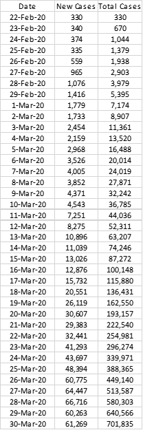
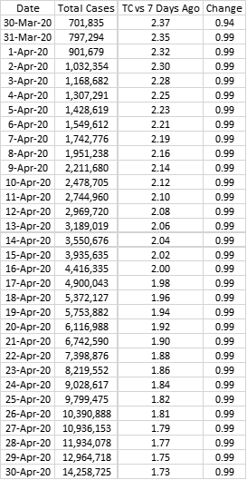
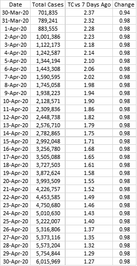
The table below is based on Worldometer data and shows the global Coronavirus cases excluding China:
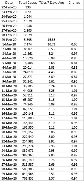
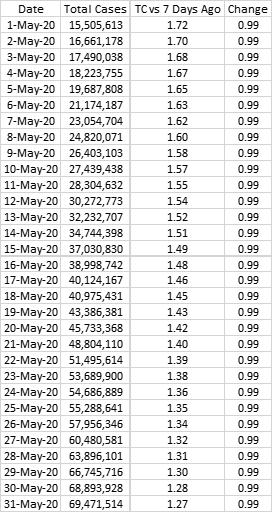
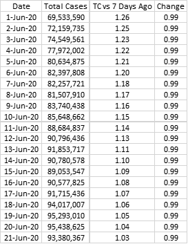
I have used ssimple tracking method by comparing Total Cases on a given day compared to Total Cases 7 days ago. Here’s how that table looks:
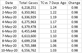
As the TC vs 7 Days Ago ratio converges to 1, the peak in the cycle will be reached around those couple of days. Given ample social distancing and certain isolation measures alongside other measures, the Change factor on the far right can be expected to come down even further. Simply put Change is the ratio of TC vs 7 Days Ago on a given day versus the previous day.

This simple ratio analysis gives us various peak scenarios. Let’s look at them.

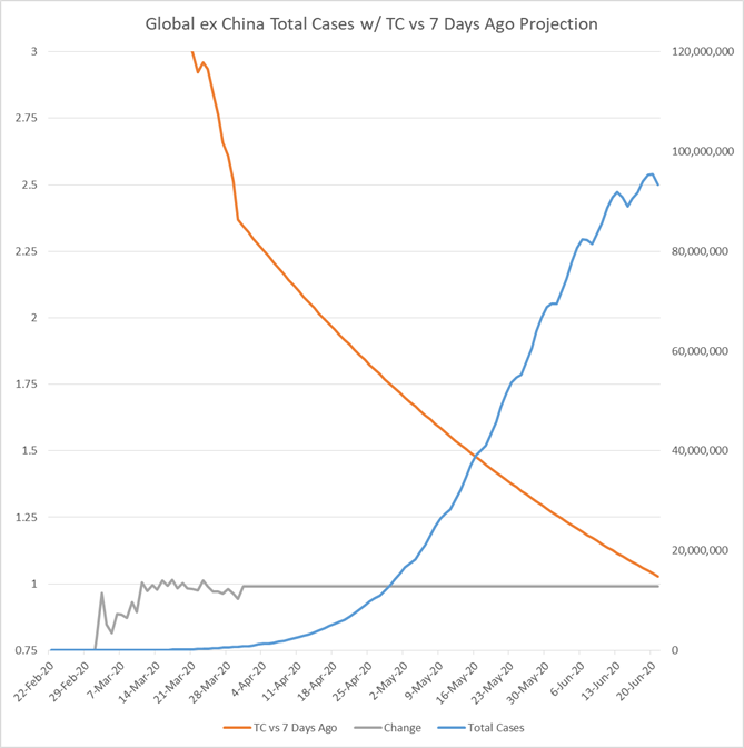
Scenario 1: Slow Decline
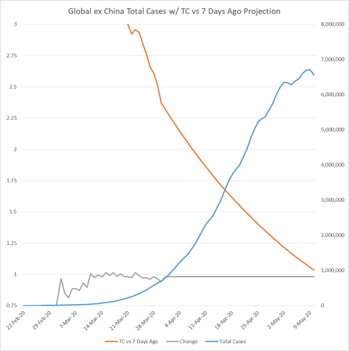
In this scenario Change factor is 0.99 which is 0.01 higher than the last 10 days. Peak is to be reached on June 20th with 95.4 million infections.
Scenario 2: Moderate Decline
In this scenario Change factor is 0.98 which is the average for the last 10 days. Peak is to be reached on May 9th with 6.7 million infections.
At this point the huge difference in numbers shows that a small change in the trajectory of infections now could make a huge difference in couple of weeks. Given the recent data, a worse than Scenario 1 seems unlikely unless some negative shock happens. From China to Italy, control albeit slower in certain cases can be achieved.

Similarly something better than Scenario 2 (while slightly more plausible than something worse than Scenario 1) would be a positive surprise which I would not expect. If control measures achieve the targeted result, it is possible that sometime around mid-May sees the peak of the infections with somber mood persisting until late June by which time this phase of the pandemic would be under control. For now this seems to be the most likely scenario. Even in a worse case such as one, this figure in timing wise is pushed out by around 2 months at max. However more important than time, Scenario 1 would have a significant associated death rate even if recovery rate improves.

The risks that have not gone in to the global figures are underreporting by some countries, severe lack of testing that complicates the figures and the effect of pandemic in regions of Africa less prepared to deal with its effects. Combined together these factors could have a major impact but more dramatically, they might rather end up concentrating the infection in certain regions while others recover rapidly. For the moment, this analysis does not take these factors in to consideration.

March 31, 2020

Coronavirus Active Cases Graphs: Different Paths for Different Countries

Coronavirus Active Cases Graphs: Different Paths for Different Countries All the data in this article is from - https://www.worldomete...