Pandemic Peak Projections: Two Scenarios based on a Simple Tool
This is a brief article with basic tool to predict Coronavirus peak infection time and number of cases for this phase of the pandemic.
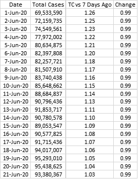
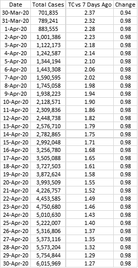
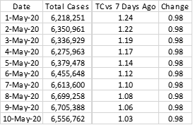
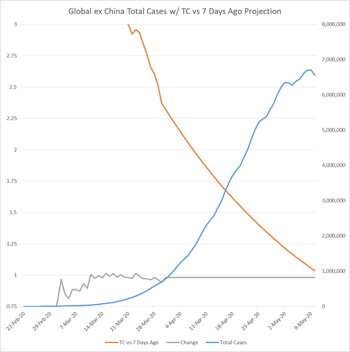
The table below is based on Worldometer data and shows the global Coronavirus cases excluding China:
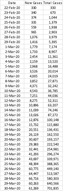
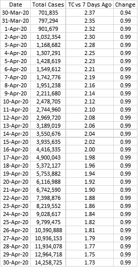
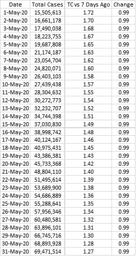
I have used ssimple tracking method by comparing Total Cases on a given day compared to Total Cases 7 days ago. Here’s how that table looks:
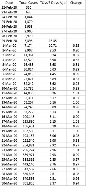
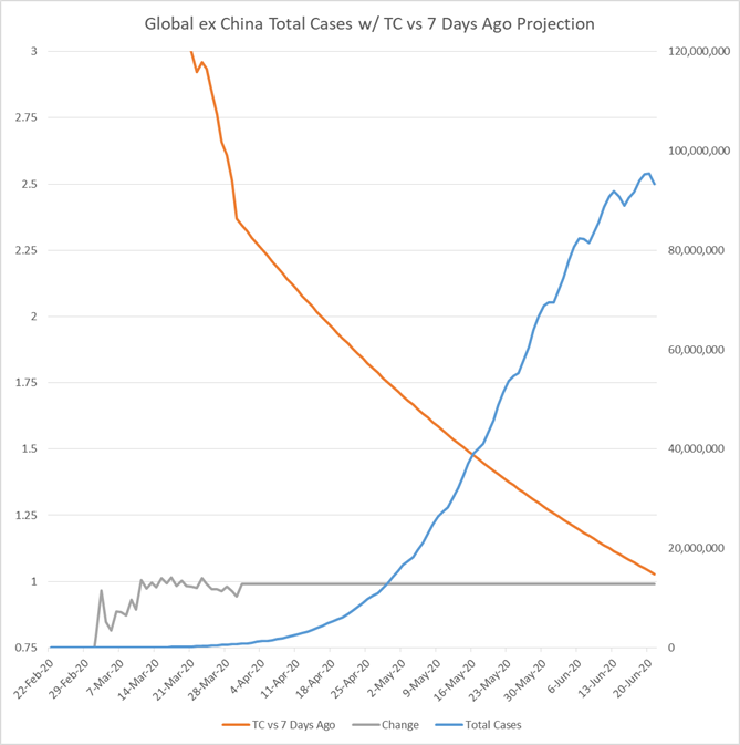
As the TC vs 7 Days Ago ratio converges to 1, the peak in the cycle will be reached around those couple of days. Given ample social distancing and certain isolation measures alongside other measures, the Change factor on the far right can be expected to come down even further. Simply put Change is the ratio of TC vs 7 Days Ago on a given day versus the previous day.
This simple ratio analysis gives us various peak scenarios. Let’s look at them.
Scenario 1: Slow Decline
In this scenario Change factor is 0.99 which is 0.01 higher than the last 10 days. Peak is to be reached on June 20th with 95.4 million infections.
Scenario 2: Moderate Decline
In this scenario Change factor is 0.98 which is the average for the last 10 days. Peak is to be reached on May 9th with 6.7 million infections.
At this point the huge difference in numbers shows that a small change in the trajectory of infections now could make a huge difference in couple of weeks. Given the recent data, a worse than Scenario 1 seems unlikely unless some negative shock happens. From China to Italy, control albeit slower in certain cases can be achieved.
Similarly something better than Scenario 2 (while slightly more plausible than something worse than Scenario 1) would be a positive surprise which I would not expect. If control measures achieve the targeted result, it is possible that sometime around mid-May sees the peak of the infections with somber mood persisting until late June by which time this phase of the pandemic would be under control. For now this seems to be the most likely scenario. Even in a worse case such as one, this figure in timing wise is pushed out by around 2 months at max. However more important than time, Scenario 1 would have a significant associated death rate even if recovery rate improves.
The risks that have not gone in to the global figures are underreporting by some countries, severe lack of testing that complicates the figures and the effect of pandemic in regions of Africa less prepared to deal with its effects. Combined together these factors could have a major impact but more dramatically, they might rather end up concentrating the infection in certain regions while others recover rapidly. For the moment, this analysis does not take these factors in to consideration.
March 31, 2020


No comments:
Post a Comment